ManyContacts
Tips and Best Practices:
Getting the Most Out of ManyContact
Improving conversion rates requires three things:
- A Prominent and Simple Conversion Form
- A Free Giveaway or Coupon
- A Great Call-to-Action
Luckily, ManyContacts takes care of the challenge to display your conversion form prominently. The bar at the top of the screen is in an optimal position to catch the eye of visitors without being obnoxious, and it stays on-screen when you scroll.
Form Design
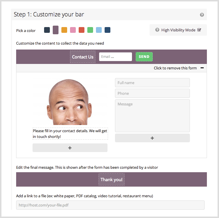
Here are some best practices for designing your form on ManyContacts.
Color
Choose a color for your Widget based on how well the call-to-action button stands out from the rest of your website. Test this by squinting your eyes while looking at your website from a distance. Does the button pop out from the rest?

Optimizing Your Call-to-Action
You can edit the call-to-action (CTA) headline text and the CTA button text according to what you are offering your customers. If it is only a ‘Contact Us’ form, then the default settings for the contact Widget are perfect. If you want to offer something to your customers in return for their email address, tailor the Widget for this purpose. Take a look at the following example:

Tips
- Keep text simple and to the point.
- Tell the customers exactly what they will get in return for their email address, and make it worth it.
- Use a first person voice on the button text instead of second person. For example, use Get My Free E-book rather than Get Your Free E-Book. Try split-testing these versions; the former is known to perform better in many cases.
- Create urgency in the CTA headline by saying the offer is valid for a limited time or that it ends in 20 days. Urgency can be displayed in the CTA button text when you use words such as ‘Now’ or ‘Today.’
Form Fields
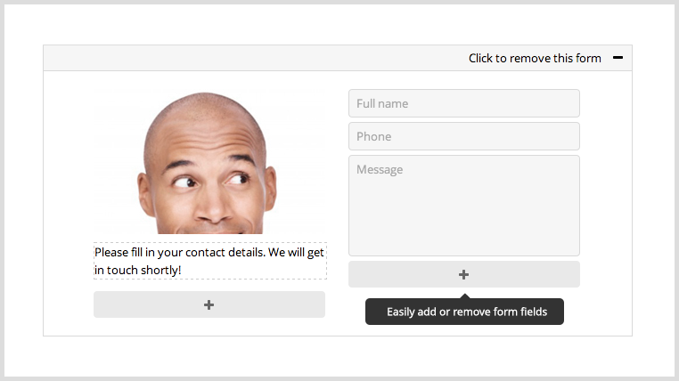
You have the option to move, add or remove form fields on ManyContacts, as shown in the screenshot below.
Tips
- If you offer something for free (for example a free ticket or sample products - see below for more details), use an image of it in this slot. A visual display of the thing on offer has a positive impact on the visitor’s decision to give you their contact details.
- You can also use the image shown in the sample above, or a similar one of a person looking toward or pointing toward the form to direct the visitor’s focus.
- Another good option is to use real images of your team. People like to connect with people, rather than faceless businesses.
- Make sure the image you upload is of high quality and good resolution. Ensure there are not so many colors that it distracts the user.
- A white background against an image of a person stands out and looks professional.
- Add descriptive text below the image with information that would not fit in the CTA headline or button. Explain how users will benefit from giving you their contact information.
- Use bullet text for easy readability.
- Keep the supporting text short, simple and precise.
Thank You Message
ManyContacts gives you the option to customize your thank you message. So, if you are offering a free trial, you could specify the trial’s active time period in this message. It is also good to inform site visitors of what to expect after they have filled in the contact form.

Tips
- Be transparent and explain exactly what the visitor can expect to happen next.
- Keep it short.
- Do not upsell anything in the “Thank you” message.
- If you have entered a link to a PDF or e-book below the thank you message, you could edit the text to say something like Click the Link Below to Download Your Free E-Book.
What’s in it for them? Including a Free Offer
The best way to convince someone to give you their email address is to give them something in return. (link to blog) This free thing should be:
- Relevant to your niche: For instance, if you own a restaurant, try a secret recipe or tips from the chef.
- Tangible: Something they can download or click to immediately rather than updates or news. (See below for tips on hosting content.)
- Exclusive: Something not available anywhere else.
Ideas of Things to Offer:
- A free e-book, otherwise available for a price.
- Free product samples.
- A free report/analysis/review.
- A free consultation.
- Discount couons.
- A free PDF on topics that intrigue your niche audience.
- A free PowerPoint presentation on a related topic.
- Free email tips, such as the ones offered by Kaiser the Sage, a popular blogger in the Philippines.
- A free video how-to tutorial.
With ManyContacts, it does not matter where the content is hosted, it can be made available through the link posted below the Thank You message.
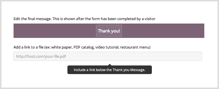
Here are some places you can host content
- PDF and PowerPoint
- ge.tt
- File Dropper
- Dropbox
- FileFactory
- Google Drive
- Video
- YouTube
- Vimeo
NOTE: If possible, adjust the settings of whichever hosting service you choose so that persons with the link can view your document but not just anyone, to ensure your offer remains exclusive.
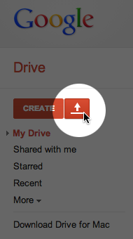
Here is an example of how to host a PDF on Google Drive. In My Drive, click the upload button beside the Create button, and choose between file or folder.
Open the file, then click the blue Share button on the top right of the screen. In the window, change the access to Anyone with the link.
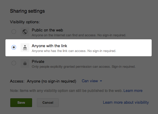
Click save, then use the link that appears in the next window to direct people to your PDF.